
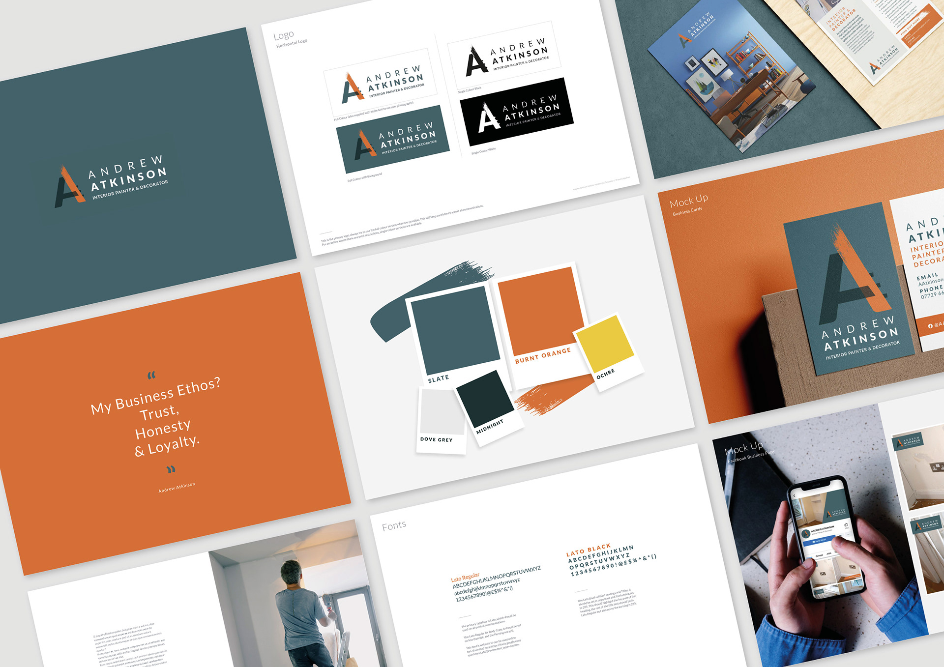


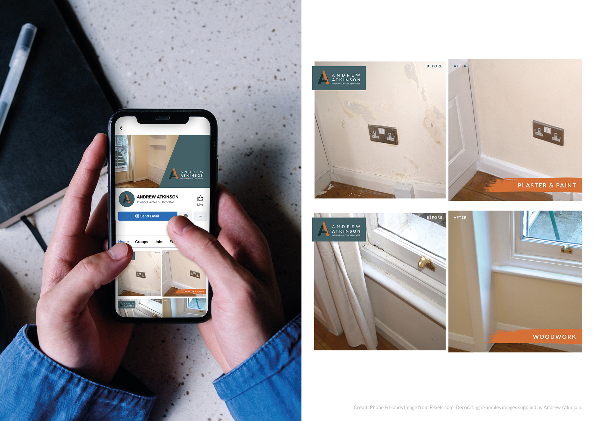

I worked with Andrew to create the branding for his Interior Painting and Decorating business.
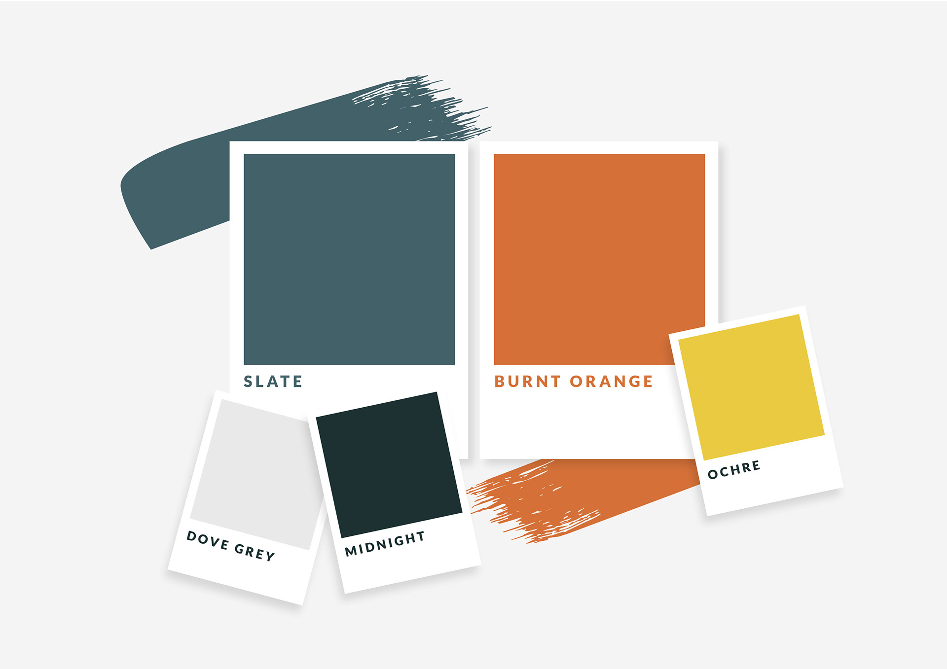
After analysing local competitors, I chose a deep blue as the primary brand colour as a point of difference in the market. It also eludes to rich traditional colours which are associated with luxury and quality to align with the brand values. The orange modernises the palette and subtly references colours we associate with DIY as a consumer.
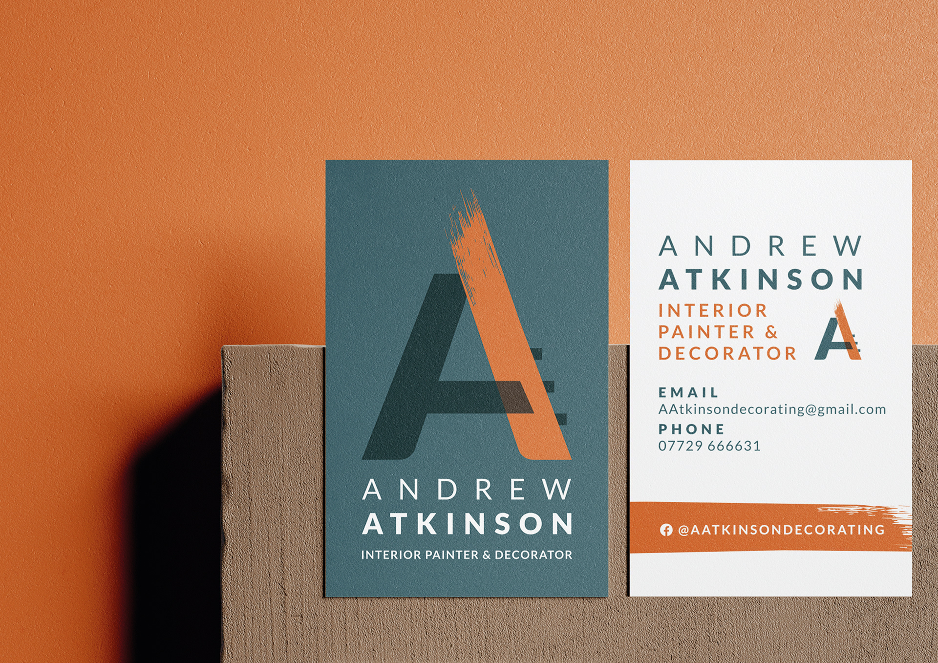
The logo uses a combination of a ladder 'A-frame' and a paint stripe to reference the nature of the business. On printed materials the orange paint stripe will also feature a spot gloss to look like wet paint.
